
 Latest images
Some more recent pieces
4 posters
Page 1 of 1

Some more recent pieces
![]() by gaztred Sun Jul 24, 2016 8:08 pm
by gaztred Sun Jul 24, 2016 8:08 pm
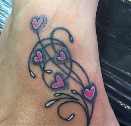
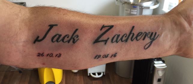
Apologies to all. Been a little dormant on the forum for a while, just been really busy. Here are some more recent pieces for your critique. As always any guidance and advise gratefully received.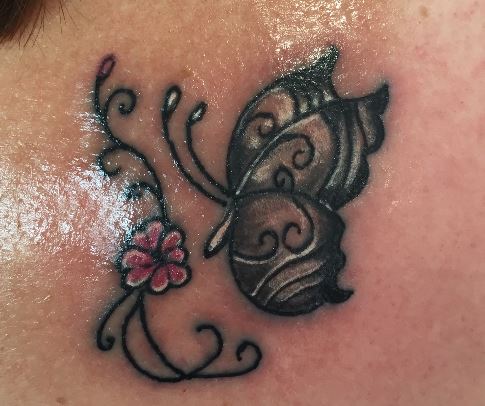


gaztred- Posts : 100
Join date : 2016-05-04
Age : 56
Location : Bucks
Re: Some more recent pieces
![]() by head Sun Jul 24, 2016 11:26 pm
by head Sun Jul 24, 2016 11:26 pm
i think you need to slow down a bit & just take your time with your tattoos as they look rushed.....your colour fill aint as solid as it could be & theres a few blow outs with your lining.... what to you use to line & colour with?

head- Posts : 202
Join date : 2016-05-07
Re: Some more recent pieces
![]() by gaztred Mon Jul 25, 2016 5:31 am
by gaztred Mon Jul 25, 2016 5:31 am
Thanks Head. To be honest I am not the quickest in the world anyway so I don't think rushing is the issue? I use a RW ID liner and fill on this was with a RW mk2 springer, a Ronnie Starr direct drive or an X1 Dragonfly. Three of the pieces are on feet and these are the first foot tattoos I did so was more hesitant of going to deep or over working so maybe why the fill is not as solid
gaztred- Posts : 100
Join date : 2016-05-04
Age : 56
Location : Bucks
Re: Some more recent pieces
![]() by Ketchup Kid Mon Jul 25, 2016 5:13 pm
by Ketchup Kid Mon Jul 25, 2016 5:13 pm
the second one w/ the hearts is really messed up. the shading around the hearts does not make sense, and its hue is strange, just off. i think it was a bad design and implementation, all around bad idea, for a chick's foot tat with flowing lines, girly hearts and lots of negative space, it came out wrong, and some blowout may spread as it heals.
the rest isn't too bad, i like that 3rd butterfly. there's something you should be doing different, unfortunately, as of this moment i don't know what it is, someone else may. all i can offer is how the piece looks in general overall, to me.
one other thing that stuck out is the kerning of the lettering in Zach. i see this waaay too often, and i think its just a matter of getting your stencil right, but see the distance between the lettering of the lowercase letters, especially towards the "achery" where is gets real tight, it is off from the distance from the capital letters, especially the Z. you may think the J is off more, but notice the top of the j is actually spaced right, but goes out an extreme angle away from the rest of the letters, making it look more off. point is, not a huge deal this time but watch your kerning. i can say i do know what i'm talking about in lettering.

Ketchup Kid- Posts : 301
Join date : 2016-05-04
Age : 44
Location : Southern West Coast U.S.A. 818/213
Re: Some more recent pieces
![]() by Loulou Mon Jul 25, 2016 10:14 pm
by Loulou Mon Jul 25, 2016 10:14 pm
sometimes gaz when your using word processing the spacing can be a bit off on the fonts , always check the spacing , like someone said the spacing looks off between the first and second letter , thats because of the space settings on the font it doesnt allow for a capital letter ( sadly i dont think you can change that ) , have a look on fontspace , download some nice fonts and see which ones work best

Loulou- Admin
- Posts : 504
Join date : 2016-05-02 -

Re: Some more recent pieces
![]() by head Mon Jul 25, 2016 11:21 pm
by head Mon Jul 25, 2016 11:21 pm
gaztred wrote:Thanks Head. To be honest I am not the quickest in the world anyway so I don't think rushing is the issue? I use a RW ID liner and fill on this was with a RW mk2 springer, a Ronnie Starr direct drive or an X1 Dragonfly. Three of the pieces are on feet and these are the first foot tattoos I did so was more hesitant of going to deep or over working so maybe why the fill is not as solid
i found with rw machines when lining you ave to get the balance just right i.e. speed,depth,volts well in my experience anyway..it was cos of them machines i went back to coils for lining as my results were inconsistent with them..
how long did each piece take you to do?....not that it really matters but might help in giving you some suggestions to try to get more of a solid fill
head- Posts : 202
Join date : 2016-05-07
Re: Some more recent pieces
![]() by gaztred Wed Aug 03, 2016 7:47 am
by gaztred Wed Aug 03, 2016 7:47 am
Head - Apologies for the late reply. below are my best recollections but not precise.
Pic 1 - 1 hour
Pic 2 - 1 hour 20 ish
Pic 3 - 2 hours 20 ish
Pic 4 - 35 mins
Pic 5 - 2 hours 40 ish
Pic 6 - 2 Hours
Pic 1 - 1 hour
Pic 2 - 1 hour 20 ish
Pic 3 - 2 hours 20 ish
Pic 4 - 35 mins
Pic 5 - 2 hours 40 ish
Pic 6 - 2 Hours
gaztred- Posts : 100
Join date : 2016-05-04
Age : 56
Location : Bucks
Re: Some more recent pieces
![]() by head Wed Aug 03, 2016 10:47 pm
by head Wed Aug 03, 2016 10:47 pm
how do you put colour in? do scrub or do circles?
head- Posts : 202
Join date : 2016-05-07
Re: Some more recent pieces
![]() by gaztred Fri Aug 05, 2016 8:13 am
by gaztred Fri Aug 05, 2016 8:13 am
Dependent on the shape of the area sometimes back and forth but in bigger areas small overlapping circular motions
gaztred- Posts : 100
Join date : 2016-05-04
Age : 56
Location : Bucks
Re: Some more recent pieces
![]() by head Fri Aug 05, 2016 8:56 pm
by head Fri Aug 05, 2016 8:56 pm
i think you just might be going too quick when you are putting colour in mate...with out see you work its just a stab in the dark..i would even try diff machines as well mate cos some times it just takes you to find the right 1
head- Posts : 202
Join date : 2016-05-07
Page 1 of 1
Permissions in this forum:
You cannot reply to topics in this forum|
|
|