
 Latest images
Right n wrong
2 posters
Page 1 of 1

Right n wrong
![]() by Whippet Tue May 31, 2016 1:16 pm
by Whippet Tue May 31, 2016 1:16 pm
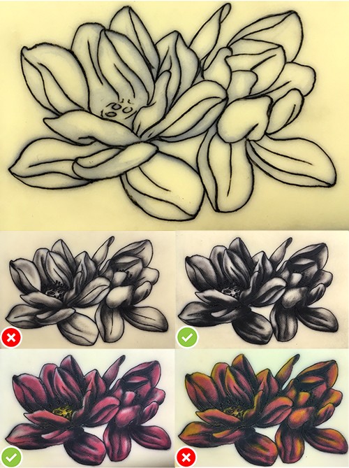
Still focused on lining, I attempted these flowers (5RL & 7M 110mm wide). I was reasonably happy with the lining.
For shading, I started with a wash mixed on the fly, looked 'ok' but i realised I'm not getting enough value range, so went back in with black and some whip shading...better (I think).
Dropped the colour in using cheap chinese ink, which I use for practise. OK (I thought), so tried to add white highlights. The practise skin would not register the white at all, where pig skin takes it quite well.
Mixed a light pink, also a no go, so tried yellow as my lightest colour....aggghhh...all went wrong (IMO).
My lesson...keep evaluating what's in front of you, but know when to stop...doh!

Whippet- Posts : 149
Join date : 2016-05-04
Location : UK
Re: Right n wrong
![]() by Ketchup Kid Thu Jun 02, 2016 6:58 pm
by Ketchup Kid Thu Jun 02, 2016 6:58 pm
good post showing and explaining the progression.
final doesn't look too bad, just a peculiar hue, or light source.
i gotta wonder how much of this applies compares to real skin.
the darker gray shading one looks nice but i see that when you add color you go right over some of the light gray with the color. which leads me to believe that you can just skip the 2nd gray step if you know your doing color, idk maybe the black underneath the color still makes a difference in the blending, hard to tell. or perhaps you were just practising.
but when you put color in over the grays/blacks, don't you wind up having to go back over some of the shading with black again, basically making it three layers?
is it customary to make a nice dark gray image like step 2 before you put in color? i wiould think you would start putting color after step 1, and wind up shading some more over the color.
i know nothing about color...

Ketchup Kid- Posts : 301
Join date : 2016-05-04
Age : 44
Location : Southern West Coast U.S.A. 818/213
Re: Right n wrong
![]() by Whippet Fri Jun 03, 2016 2:51 pm
by Whippet Fri Jun 03, 2016 2:51 pm
Yeah good observation re the overlaying of colours.
I started this piece as a lining exercise, then decided to work it up in B&G, then as an afterthought I added color. So my process is likely to be overblown.
However, based on my previous experience (tattooing real people) the greater tonal value will show through, eg. you put red over black and the black shows through. If this were not the case we would all be doing cover ups with flesh coloured ink.
You're also right that in this case the the soft grey will be obliterated with the tonally darker pink...at best a little bit may show through. I've heard of people adding shade after colour, which may work, but my understanding is that the ink settles in the dermis at the same level and the tonally greater ink will dominate. I'm sure adding shade after colour lets you judge the strength against existing ink (??) Maybe someone who works this way can enlighten us both, as I'm happy to learn anything/everything I don't know.
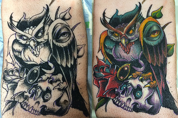
Re Black and colour: What looks 'very black' in a shaded design can be really softened when you lay colour in up to (or over) it, it loses the starkness. If you remember the owl I did on pigskin it shows this drop in contast when colour is added.
I started this piece as a lining exercise, then decided to work it up in B&G, then as an afterthought I added color. So my process is likely to be overblown.
However, based on my previous experience (tattooing real people) the greater tonal value will show through, eg. you put red over black and the black shows through. If this were not the case we would all be doing cover ups with flesh coloured ink.
You're also right that in this case the the soft grey will be obliterated with the tonally darker pink...at best a little bit may show through. I've heard of people adding shade after colour, which may work, but my understanding is that the ink settles in the dermis at the same level and the tonally greater ink will dominate. I'm sure adding shade after colour lets you judge the strength against existing ink (??) Maybe someone who works this way can enlighten us both, as I'm happy to learn anything/everything I don't know.
Re Black and colour: What looks 'very black' in a shaded design can be really softened when you lay colour in up to (or over) it, it loses the starkness. If you remember the owl I did on pigskin it shows this drop in contast when colour is added.
Whippet- Posts : 149
Join date : 2016-05-04
Location : UK
Page 1 of 1
Permissions in this forum:
You cannot reply to topics in this forum|
|
|